Here is the analysis of my questionnaire. I recieved 20 completed questionnaires back from my participants, along with two that were partially completed, but I chose to analyse the fully completed ones so that I could make more sense of their responses.
Following the analysis of each question, I have included evidence of the changes I have made to my trailer as a result of the feedback.
1. Do you think the music is appropriate for the trailer?
As you can see, 18 people thought that the music I had selected for the trailer was innapropriate, while just 2 thought that it was appropriate. As this was the first draft to my trailer, I was struggling to find an 'exciting' piece of music that was still appropriate to use on the BBC. Therefore I selected a piece that was of a fast beat, but sounded Middle Eastern. I intend to change it as soon as I find an appropriate track. Comments from some of the participants included "it sounds too Indian" and "seems inappropriate for the genre'.

Here is a print screen of the new track I have used to replace the first track I used. It is called 'Thief'' and I believe that it is appropriate for my trailer because it is upbeat, and has a fast pace. This makes the trailer seem exciting, and gives the impression to the audience that there is a lot going on in my soap opera. However, it is not too fast or loud because I don't think that it would have been appropriate for the BBC, and it may have looked like it was more suitable to be advertised on Channel 4 for example, who use louder and more upbeat music in thier trailers. This music is much more appropriate because it is a simple beat that fits in well with the moving images, and adds a rhythm to the trailer as a whole.
2. Is the trailer the right length?
As you can see, 19 out of 20 participants thought that my trailer was of the right length for a conventional soap opera trailer. 1 person thought that the trailer was not of the right length, and wrote the comment 'it could be shorter - its 45 seconds and typical trailers are 30-40'. Although I understand that this is the case of most soap opera trailers, I have discovered ones that are much shorter or even longer (see 'Research of Soap Trailers'). For this reason, I realised that it all depends on the content of the trailer that depends on the length. I did want to stick quite close to the familiar convention however, and I personally believe that the extra 5 seconds does not make the trailer seem to long, but instead it provides information as to when it starts, what time and on what channel. Also, 19 participants thought that the length was appropriate.

Because most of my participants believed that the trailer was the right length, I have kept my final draft at the length of 43 seconds.
3. Does it work well with no dialogue?

For this question, 18 participants answered 'yes', while 2 answered 'no'. During the planning and research process of this task, I noticed that some trailers did have several lines of dialogue, whilst some had none at all. However, almost all of them have a voiceover at the end or even at the beginning to provide audio information about the soap. I therefore included a voiceover in my trailer. However, I personally chose not to use dialogue in my trailer because I wanted to include an element of mystery, which would entice audiences to want to watch the soap when it begins. Also, I noticed that the other trailers with dialogue in them were from soaps that had been running for a long time, and so the audiences would be familiar with the characters talking, and their storylines. Because my trailer is the advertising the beginning of my soap, I thought that dialogue would be too complicated for the audience, who are at this stage unfamiliar with the characters and their storylines. I did film each storyline with some dialogue, and then again without it though, so that if need be I could change my mind and make alterations.

As you can see here, I have a music track in my trailer, but there is no dialogue. However, most participants agreed that it worked well without dialogue, and it would have been complicated to add some in after I had deleted it, so I kept it the same. I did, however, add in a voiceover at the end of my trailer, as this is a common convention of many other soap opera trailers. This means that even if an audience member isn't paying attention to what is playing on screen, they will still be able to hear the important information of the soaps title, when it starts and what channel it is on. I watched a series of other soap opera trailers that were aired on BBC1, because thats the channel I intend for my soap to be aired on, and I noticed that the voiceovers were mainly a female speaker with a clear voice and a normal English accent. I decided to stay in the trend of BBC1 voiceovers and decided that actually, my media studies teacher had a very clear voice and a typical English accent and so I asked her to record a voiceover for me, stating the program's name, when it starts and the channel it airs on.
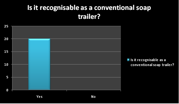
4. Is it recognisable as a conventional soap trailer?
I was very pleased with the results of this question. As you can see, all 20 of the participants believed that my soap trailer was recognisable as a conventional soap trailer. To me, these results show that I have done a sufficient amount of planning and research to make my soap trailer successful. Comments that people wrote included 'it looks really realistic!' and 'it all works together well.' I realise that there are a few small changes that I need to make, but the results of the overall questionnaire made me confident that I was close to finishing my trailer completely.

Although I was very pleased with the results of this question in the questionnaire, I decided to change the end title. This is because in my first draft it stated that my soap was 'Coming Soon'. To me, this seemed too general and that my soap needed a specific time and date for it to start so that audiences knew for definite when to watch it. I also made the font bigger so that it was clearer, and, due to technological convergence, I included a website that gives the audience an opportunity to watch 'Eaton' online in case they miss it.
5. Do you think we have used an appropriate amount of different characters?

Again, I was very pleased with the results of this question because everybody thought that we had used the right amount of characters. From looking at other trailers for soap operas such as 'Neighbours' 'Hollyoaks' and 'Coronation Street', I noticed that they tended to use at least 6 different characters. However, there was one 'Eastenders' trailer that featured just the characters of Peggy and Archie. Although, this was to advertise a storyline that focused predominantley on those two characters, rather than the launch of the soap itself. I also noticed that the launch trailers of some soaps featured all of the main characters. Interestingly thought, it was 'Eastenders' that was the odd one out. The launch trailer did not feature any of the chracters, but instead it showed a bus driving around London. However the trailer was almost 30 years old and I belive that in more modern times, trailers that actually feature the characters are more successful because they are simply more interesting. I think that 4 storylines and 10 characters (even minor ones) is just the right amount to conjure a curiosity from our audience, without confusing them.

This is an example of the most characters we feature in one shot. However because it could be quite difficult for the audiences to remember the roles of each character, we had the female on the left and the female on the right as just minor characters, and so they just stood behind the bully to emphasise the power she has over the victim. I also asked each character to wear a different colour top or coat, and to try and wear their hair different so that audiences will not be confused. We had the victim wear a bright yellow coat so that she stood out and was easily recognised.
6. Have we used enough different camera shots?

17 out of 20 participants believed that we had used a good range of camera shots. However, 3 participants believed that we had not used a good enough range of camera shots, and luckily 2 of those three had left comments. The first comment states 'it was good, but you could have used a long shot for the Eaton Oak'. The Eaton Oak is the main pub that is featured in my trailer and I have used a mid shot at the very beginning to establish this, as well as the location, as the soap is called 'Eaton'. We intially shot this frame as a long shot, but the Eaton Oak is on a busy road, and by the time we got far enough away with our video camera to make the shot a long shot, we were across the road and cars and road signs were blocking the shot. So we then decided to move the frame upwards slightly, and have some sky in the background, but we then noticed that the sign was not clear enough for the audience to read. It was then we agreed to do a mid shot that included the majority of the building itself, and that made the sign easy to read. The other comment read 'too many midshots'. However, from researching other soap opera trailers and soap operas themselves, such as 'Eastenders', 'Emmerdale', 'Coronation Street' and 'Hollyoaks' I have noticed that the main shots that are used are in fact mid shots. I thought that they were effective because they still showed detail, but were at the same time they often revealed setting as well as characters. It was for this reason that I decided to use mainly mid shots in my trailer. However, I have used some close-ups, over the shoulder shots and long shots so I personally believe that there is a good range of different shots in my soap trailer, and so do the majority of the participants of my questionnaire.

This is an example of some of the different camera shots and angles we used. The top right is an example of one of the long shots I used, and in this case it follows the elderly lady as she carries the cup of poisoned tea to her husband. This shot causes suspense because the audience is unsure as to what she is going to do with the poisoned tea, and has to wait a few seconds to watch her walk down the coridoor. The frame in the top right is an example of one of the close-ups I used. This shot is for emphasis of the elderly lady's actions, which is putting two mystery pills into a cup of tea. The use of a close up also means that the audience can see clearly what the elderly lady is doing, which helps them to understand that particular storyline. The frame in the bottom left is an example of a mid-shot I used. This shot allows the character to be shown clearly, so that the audience can recognise her and her role, but it also shows some of the setting, and her actions. Even though her husband has left for work, she is clearly seen making two cups of tea. It is in the next shot that we realise that the second cup of tea is for her 'lover'. The frame at the bottom right is an example of a low-angle shot I used. I used this particular shot because I wanted to show the bottle of vodka hitting the floor when the bully pushed it into the victim's chest. I thought that the shot would emphasise the action, as well as look dramatic, which would hopefully entice audiences into watching my soap.
7. Do you think I should have used transitions between each storyline?
18 out of 20 participants believed that my trailer was effective without transactions to break up each storyline. I initially asked this question because I believed that my audience may experience difficulty in telling the difference between each character. However, I solved this problem by putting the storylines in a different sequential order, for example I knew that the audience would not be confused between the characters in the 'affair' storyline and the 'drug dealing' characters, so I placed those two storylines together. From studying previous soap trailers, I noticed that the editing mainly consisted of basic cuts, rather than complex transitions or effects. To follow the convention of realism within soap operas, I personally believe that transitions make the trailer look realistic, and often of another genre of television altogether. As you can see in my graph, the majority of my participants agree with me.

The frame on the left is the final frame in the 'poisoning' storyline, which then (in 0.3 of a second) as you can see on the timeline, cuts immediately to the first frame in the 'peer pressure' storyline. I think that the cuts are more effective because they are dramatic and to the point.
8. What is the most successful part of the trailer so far?
Most of my participants decided that their favourite storylines wer the 'poisoning' one and the 'affairs' storyline, and that thier favourite part was the realism of the trailer overall. Some comments included: 'I liked the part where the old lady poisoned her husband, it made me want to see what happens after' and 'the title at the end looked the same as the ones on the BBC'.

Frame number one is a shot from the 'poisoning' storyline, which due to the positive audience feedback, I have kept exactly the same. Frame 2 is an example of the modified end title, which as I mentioned before, I changed slightly to make it more specific as to when the soap begins. I did however, keep the same background, the BBC1 logo and the font, as they seemed to be quite close to the real BBC titles. Frame 3 is from Adobe Premier Pro, which is the software that I used to edit my trailer. It shows some of the things I added to my trailer to enhance the realism such as music, a BBC1 logo in the corner and a voiceover. Frame 4 is from the 'affairs' storyline, which I also kept the same due to the positive audience feedback.
9. What is the least successful?
Every single participant answered that the music was the least successful part of my trailer.

This is the track that I used for my music in my first draft of my soap opera trailer. It was in the 'Modern Rock' section of the website
http://www.freeplaymusic.com/. I used this website because all of the tracks are copyright free, which means that I could use them for my trailer. However, there are thousands and thousands of tracks available, so I had difficulty selecting one that I thought was perfect. Eventually I found a track called 'Thief which is described as 'easy stepping beat with a big bass rumble accented by synth effects, with a funky simmer'. I always knew that I wanted quite a beaty track, and the original track I chose begins that way, but moves into what seems to be Indian music, which I didn't think was appropriate for my trailer. 'Thief' however, is just a simple beat that is at just the right pace for my trailer, and doesn't fit into a specific genre and therefore I believe that it will appeal to all members of my audience.
10. Is there anything in particular I can improve to make the trailer more successful?
Again, for this question the majority of participants answered that I should alter my music. As I mentioned previously, I have changed my music to a more suitable track which fits the genre of soap operas well.